Outside In
Munich / Hamburg, 25th March 2021. Geometric ornaments in terracotta and white. Anyone who knows the Marienplatz in Munich is aware of the impressive facade with eye-catching motifs carved in stone at the LUDWIG BECK department store. The reinterpretation of the contemporary and cosmopolitan work by Max Lacher from 1956 can now be found in the new women’s clothing department. It will officially open on 25th March 2021. Outside Inside – Hamburg interior designer Claudia Breil of Breil + Interior Design has succeeded in bringing the “outside” inside.
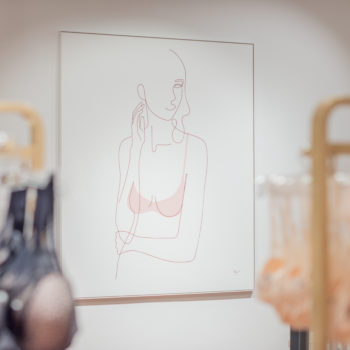
Breil uses patterns, colours and shapes from the listed facade as design elements, interpreting them elegantly and refreshlingly. Carved wall motifs, floor tiles – the exterior facade pattern is the main theme that runs through the new 1,600 square metre area. It serves as an orientation system, subtly guiding customers through various sections of the store. Here you can find brands such as Munthe, Stine Goya, Officine Generale, M Missoni and By Marlene Birger in the upper area. Shops from partners such as Marc o Polo, s.Oliver, Comma and More & More can be found in the lower area.
The comprehensive material, colour and shape concept is made up of terracotta with bright white shades, and in combination with caramel and green shades. A premium look inspired by the facade, and hip metropolitan hotels. Munich meets trends from London, Milan and New York, inviting LUDWIG BECK visitors to a unique shopping experience. Floor-to-ceiling windows on the first floor create the impression of floating above Marienplatz. Outside merges with inside. “The Curve”, the arch shape, is a recurring theme – from furniture to rail hanging. A serpentine shape can be found in various rear wall designs and on wall tiles, alternating with lacquered surfaces, or as an amorphous interpretation as a relief wall.
The highlights and aspects of sustainability
First impression: The escalator takes visitors to the “First Impression” area. Here, space-defining elements connect through a delicate metal construction. Rust brown metal meets a sustainably produced rattan veneer in matt green. The veneer, with its unique pattern, gives “First Impression” a modern and premium look. Large perforated metal wall sheets in caramel tint create contrast.
The Corner: At the heart of the women’s department is “The Corner”. An area facing the famous Marienplatz. Elaborate UV and heat protection films inside and outside, as well as modern lighting design, create a pleasant mixture of artificial lights and daylight. (Lighting design: Ansorg). A delicate wall module system with white metal arches reminiscent of the arcades of a Venetian piazza. The arches provide a view of Marienplatz. Internal space holds the “Market Place” – a flexible level with multilane displays (Visplay). The modules hanging from the ceiling can be moved and changed easily to display art, or for events or product promotions. A lively room that can be individually adapted to suit emerging needs. A special place to linger is the lounge area with a magnificent view of Munich City Hall (interior / furniture: Cor, Moroso and Pedrali via Marcus Hansen). Rough and authentic – the jeans department “E” is framed by a relief wall made of ash wood tiles. The rough cut veneer has a three-dimensional embossed surface. The relief shows the course of the veneer analogous to the growth of an ash tree using the design principle of “The Curve”. The rough structure (handmade by Lauinger Ladenbau) reflects the character of the department.
“Designing interiors, and in doing this, incorporating the outside world has always given me a lot of joy in my work. Whilst working on the project at LUDWIG BECK, this has reached a new dimension” says Claudia Breil. Outside Inside – contrasting perspectives that take on a deeper significance in view of the pandemic. The design development was influenced by the current situation. How can a clothing retail area create a pleasant, feel-good atmosphere for the consumer, a place where one can relax during these times? Breil+ Interior Design is setting an example against the current cool 90s design trend. Simply impressive.